Benjamin Moore Paint Colour Trends and Popular Choices
Colour shapes how your home feels the moment you step inside. The shade on the walls catches the morning light in the kitchen, sets the tone for family dinners, and frames quiet evenings in the living room.
Many homeowners turn to Benjamin Moore when choosing colours that feel personal and current. The right palette can bring out the character of your furniture, highlight architectural details, and help each room flow naturally into the next.
When colour, finish, and lighting work together, a home feels right from the moment you walk through the door.
Why Colour Selection Matters When Choosing Paint
Paint colour influences how a room feels. Some colours make a space feel brighter and more open, while others create a warmer, more relaxed atmosphere where people enjoy spending time.
Lighter colours reflect more natural light, which can help smaller rooms feel brighter and less enclosed. Deeper colours add contrast and bring a sense of richness to the space.
Paint also interacts with everything already in the room. Flooring, cabinetry, furniture fabrics, and natural light all affect how a colour looks once it’s on the wall.
Popular Benjamin Moore Paint Colours Homeowners Love
Some Benjamin Moore colours stay popular year after year because they work in many types of homes. Homeowners often choose them when they want something timeless that still feels current.
A few favourites people return to again and again include:
- White Dove OC-17: A soft white that feels warm and welcoming. Many homeowners use it on walls, trim, or cabinetry.
- Revere Pewter HC-172: A balanced greige that works well in living rooms, hallways, and open-concept spaces.
- Super White OC-152: A crisp white with a slightly cool tone that creates a clean, simple look.
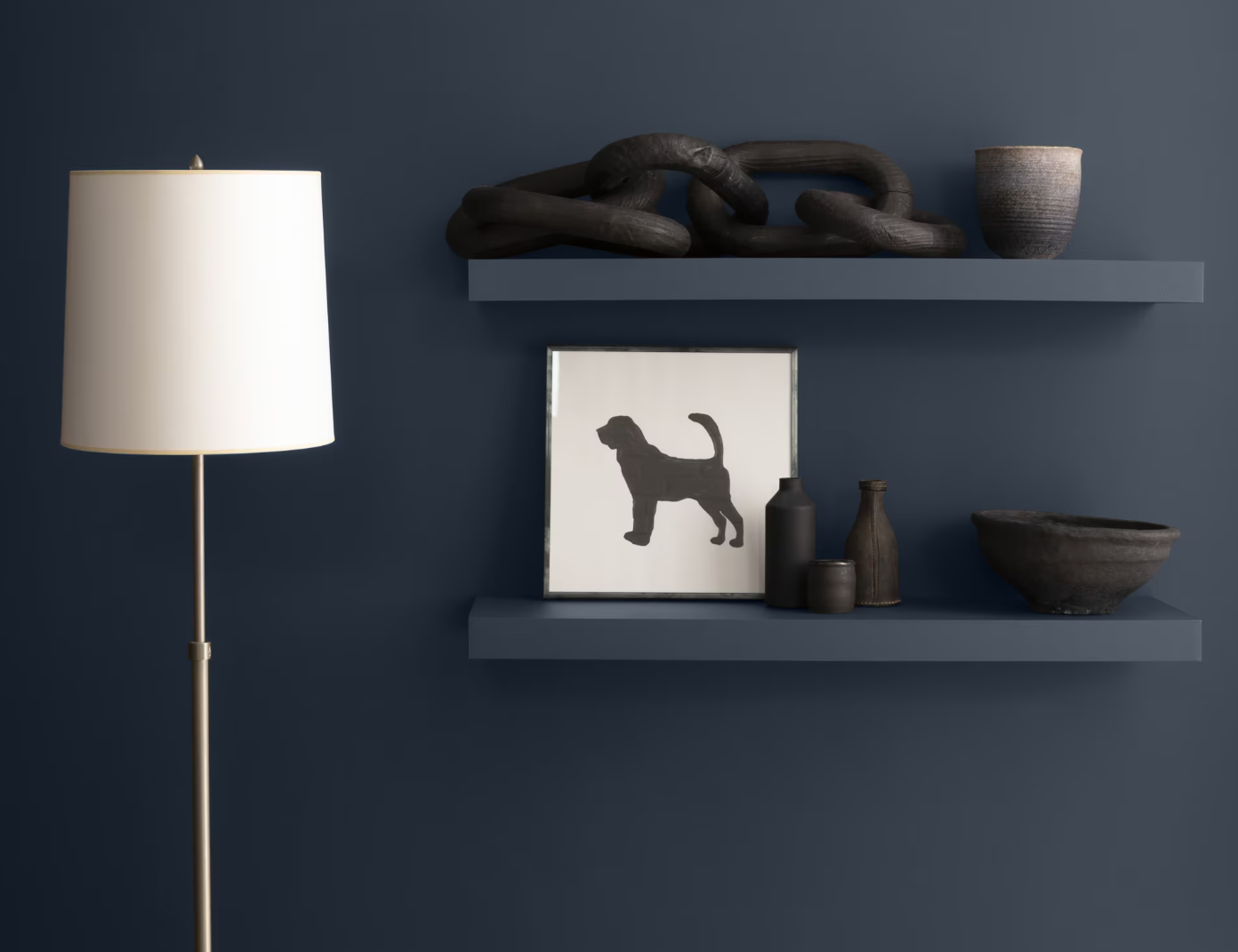
- Hale Navy HC-154: A rich blue that adds personality to accent walls, cabinetry, or home offices.
Current Colour Trends Using Benjamin Moore Paint
Many homeowners today lean toward colours that feel comfortable to live with every day. Natural tones and soft layers help spaces feel relaxed while still adding personality.
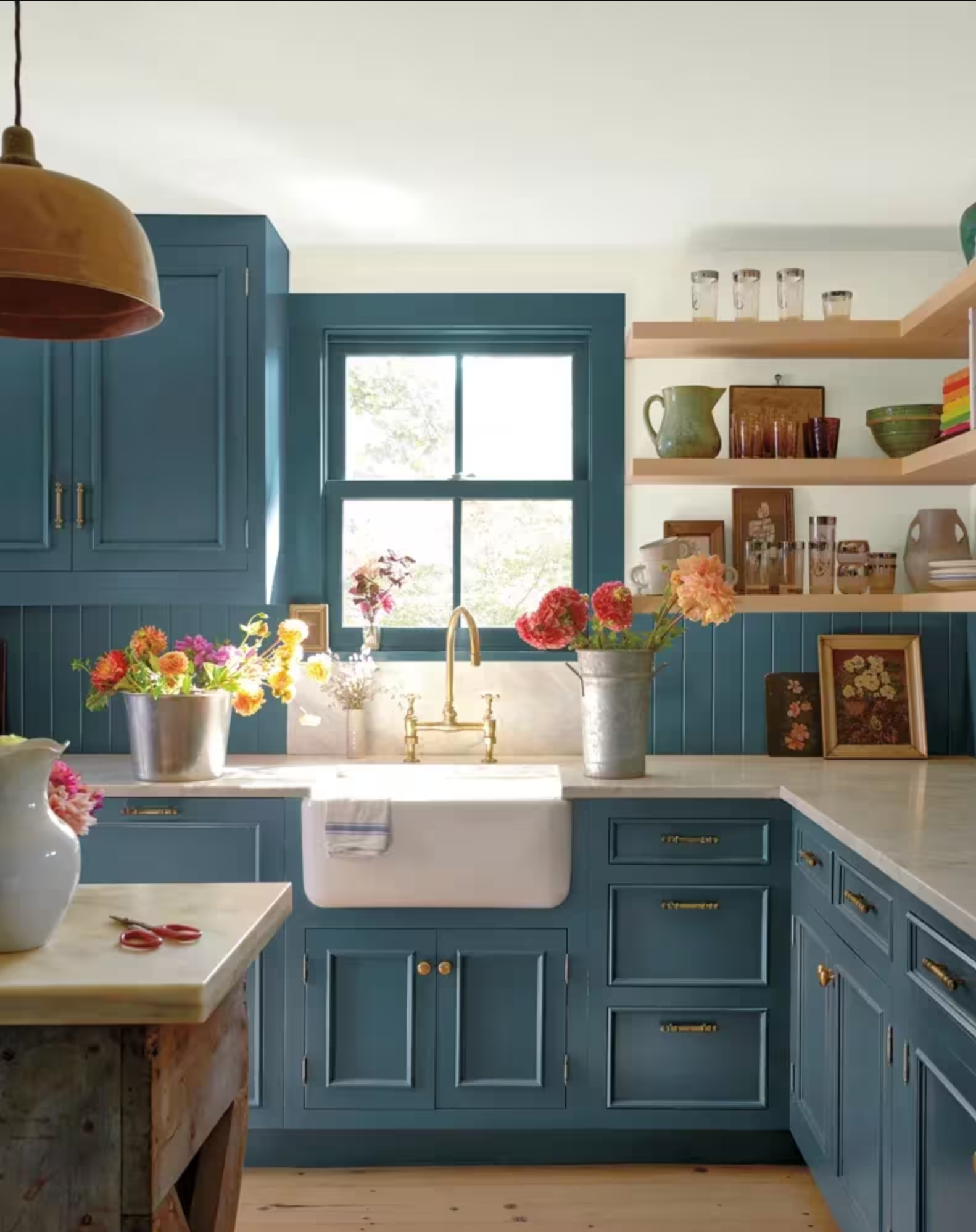
Earth-Inspired Tones
Colours drawn from nature continue to gain attention. Warm browns, soft greens, and muted blues pair well with wood floors, stone accents, and other natural materials, creating a calm, welcoming atmosphere.
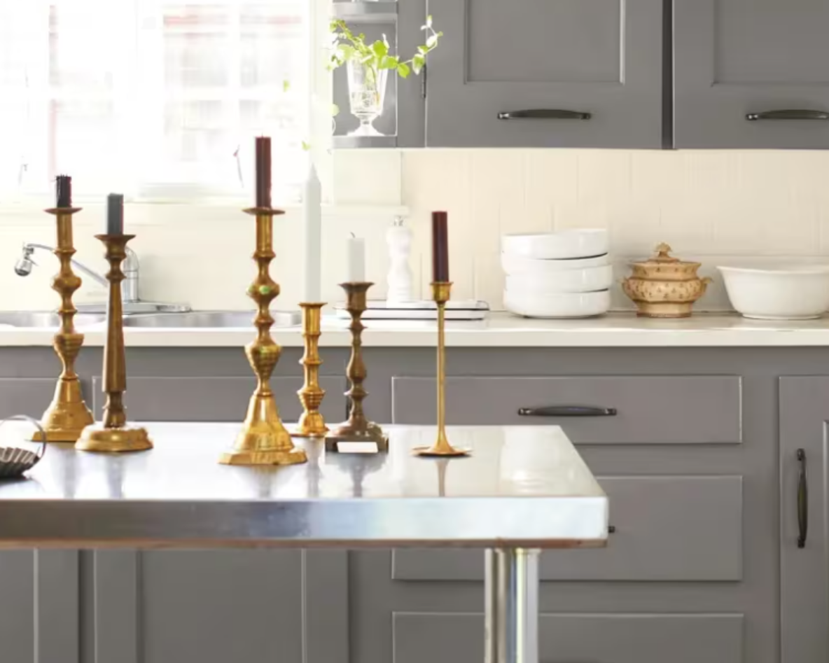
Layered Neutrals
Designers often build a palette using several shades from the same colour family. A soft neutral on the walls, a slightly deeper tone on cabinetry, and crisp white trim can add depth while keeping the room comfortable and easy to live in.
Accent Colours
Many homeowners introduce bolder colours in smaller areas. Kitchen islands, built-in shelving, and statement walls offer places to add personality while keeping the rest of the home balanced. Colours from Benjamin Moore collections often appear in these accent features, giving the space a subtle focal point.
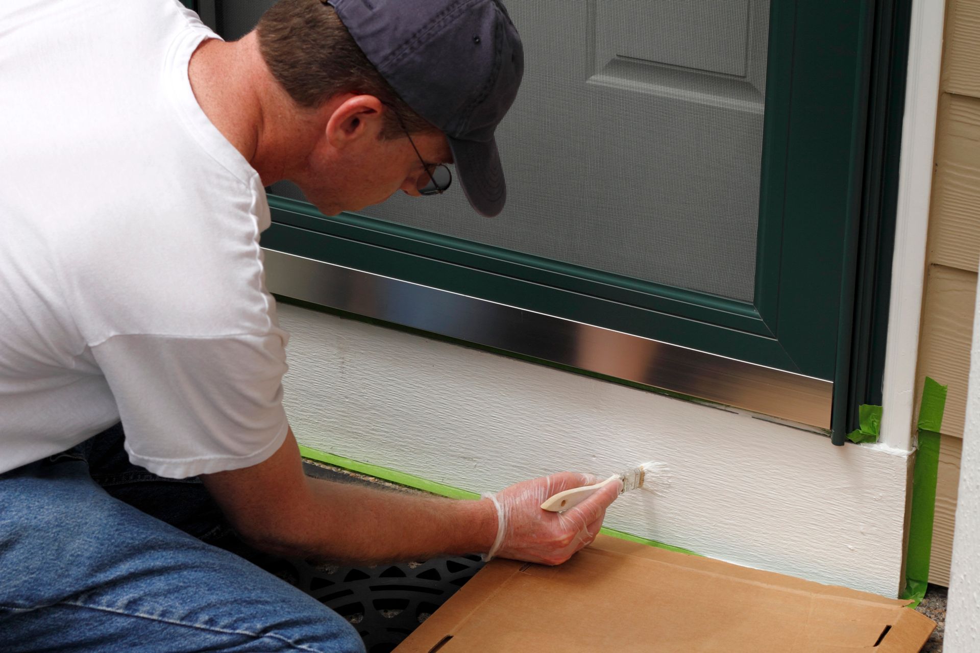
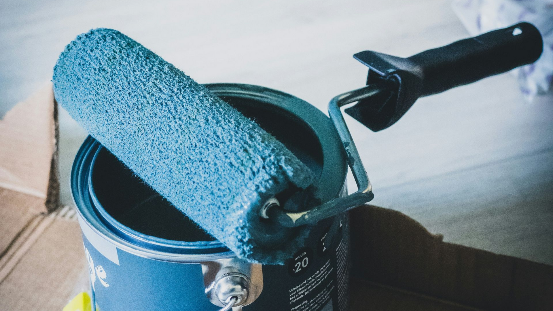
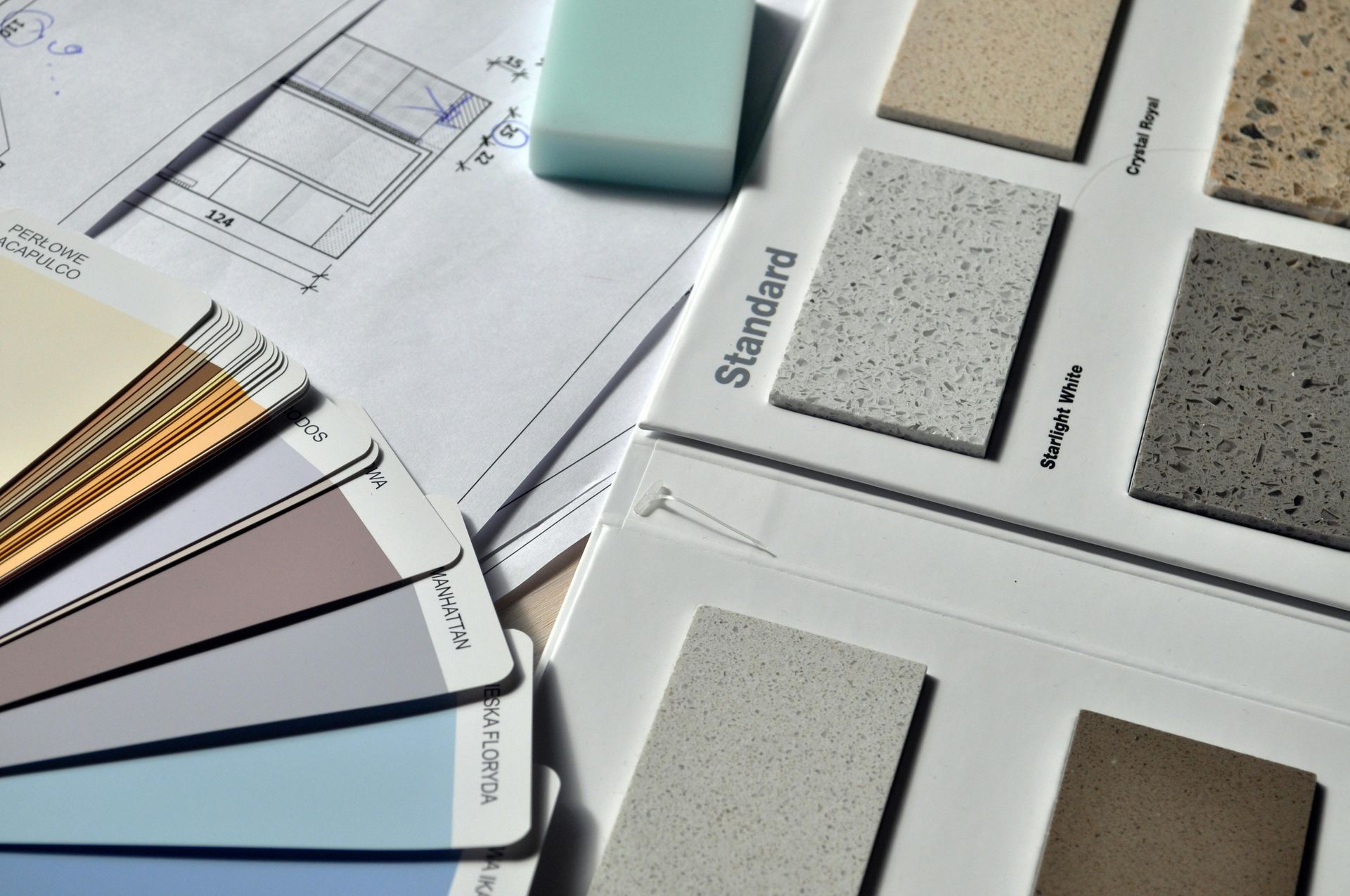
Tips for Testing and Choosing the Right Colour
Seeing paint in your own home often makes the decision much easier. Small paint chips rarely show how a colour will actually feel once it covers a wall.
Many homeowners test colours in their space before committing by:
- Using sample pots to paint sections of the wall
- Viewing the colour at different times of day as natural light changes
- Comparing a few colours side by side to notice subtle undertones
- Checking how the colour looks beside the flooring, furniture, and cabinetry
Bring Your Colour Palette Together
Choosing the right Benjamin Moore paint colour is easier with experienced guidance. West Springs Paint and Design’s colour consultants help homeowners explore colour options, compare paint finishes, and select products that match each room.
Contact Us
SOURCES
https://www.benjaminmoore.com/en-ca/colour-overview/colour-insights/colour-handbook
https://www.benjaminmoore.com/en-us/color-overview/color-palettes/most-popular-colors/
https://www.benjaminmoore.com/en-ca/paint-colours/most-popular
https://www.benjaminmoore.com/en-ca/colour-overview/colour-insights